Google Maps is going through a bit of a makeover at the moment. There will, sooner or later, be an entirely new version of the web-based maps (which you can see in preview if you switch to the beta option), but in the meantime some of the changes that are part of the new version have also been rolled out the the existing system.
One of the things that has been changed is the colour scheme. Previously, Google used standard local mapping conventions for road colours. So, for example, in the UK motorways were blue and trunk roads were green. In France, toll autoroutes were green and non-toll autoroutes were red. That fits with signage, in both countries.
The new colour scheme, though, does away with all that and renders all roads, everywhere, in various shades of orange and grey.
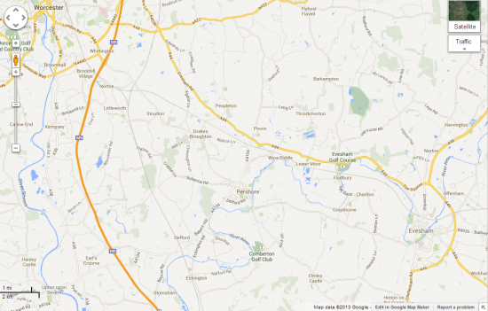
I think that’s a really bad move. So do lots of people. But it’s probably best illustrated with an example. Here’s a screenshot of my local area using the new version:
(Clicking on the map will open it in a lightbox. If you don’t have a large monitor, then right-clicking and choosing “open link in new tab” will probably be better as it will allow you to see it actual size. The same goes for all the maps on this page).
The map shows Evesham at the bottom right, Worcester at the top left and Pershore in the middle. Up the left hand side runs the M5.
The major routes are reasonably easy to see, although there isn’t much of a visible difference between the motorway and other trunk roads. But can you see where the non-trunk A roads are on that map? What about the B roads? Can you tell the difference between them and unclassified roads?
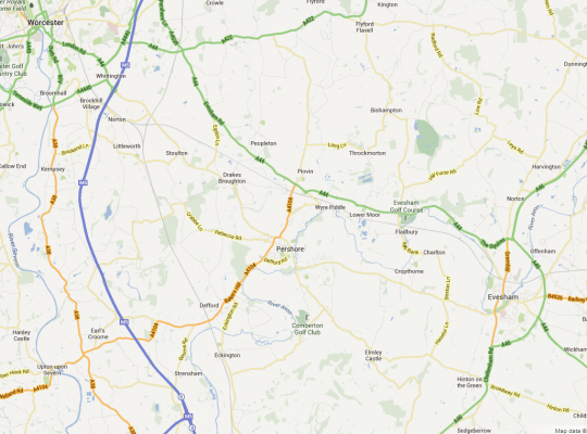
The answer to that, as I’m sure you’ve realised, is that you can’t tell. Here’s the same area in the older version:
It’s immediately obvious at a glance how much clearer that is. Most importantly, Pershore is no longer isolated in a sea of back roads – you can see both the A4104 running north-south through the town, as well as the B roads linking it directly with Evesham and Worcester. Evesham, too, now has the key central spine road showing in a different colour, and, to the west of the M5, you can see the A38 which forms an important local connector in the area.
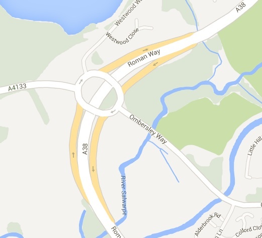
OK, so you may argue – that’s just the overview, you can see more detail by zooming in closer. Which is true. But the colours still don’t work. Here’s a rather bizarre splash of colour in Droitwich Spa, for example, where the main road is white but the slip roads at a junction are orange:
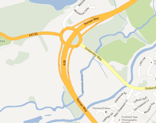
And here it is in the older, clearer version:
So why the change?
It seems to me that Google has forgotten one of the key principles of cartography: a map is intended as a representation of reality, not a work of art. To be sure, roads aren’t really painted blue, or green (or orange), so the actual colour you use for them is something of an arbitrary choice. But the way that roads are classified and used is not arbitrary, and there is a long-standing convention in map-making that the colours and iconography relate to those use in non-mapping documentation.
Going back to the first map, at the top, if you wanted to get from Wyre Piddle to Upton upon Severn, which way would you go? The map gives no obvious clues – you might assume that the only alternative to negotiating a maze of twisty country lanes is to go via Worcester. In the second map, it’s obvious: follow the A4104 through Pershore and Defford.
But, of course, people don’t use online maps in that way any more. Instead, if you wanted to get from Wyre Piddle to Upton on Severn, you’d use the “show directions” facility of the map. And, yes, it will correctly take you through Pershore. (Here’s a link showing just that, for comparison purposes).
And I think that is the key point here. Google no longer expects users to use its maps as maps. Instead, it expects the maps to be merely a means of conveying other data, such as computer-generated routes, and advertising, and links to other Google products. The idea that someone would look at a map, and, just by looking at it, be able to tell how to get from one place to another seems incredibly old-fashioned. And so there’s no longer any need for the visual clues necessary to make map-reading easy and intuitive.
I think, though, that that’s still a mistaken assumption. Yes, one of the primary uses of Google Maps (and Apple Maps, and Bing Maps) is for computer-generated route-finding. But it isn’t the only one.
It’s telling, too, that many of the positive comments you can find about the new Google Maps (and yes, there are plenty) online are all about how slick it looks and how “cool” the colours are. One review points out that “The redesign brings Maps into sync with the look and feel of the modern Google design aesthetic”, which is certainly true. Others, like this one, talk about how easy it is to use the new maps to search for pizza. As a local search tool, it is pretty good.
I suppose we shouldn’t be surprised that Google wants the new Google Maps to be more about Google than Maps. But building in the new features doesn’t have to mean ditching the best of the old. And I find myself using Google Maps a lot less these days, so all those new features are wasted on me.
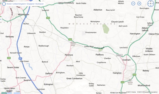
So what are the alternatives? Here are some screenshots of the competition, starting with the most obvious, Bing:
I quite like Bing Maps. They get the colours right, and the web interface has the option of using OS maps at closer zoom levels, which is a very, very good option indeed. But, at the wider level, the colours still seem a bit too muted and there isn’t as much detail as there could be.
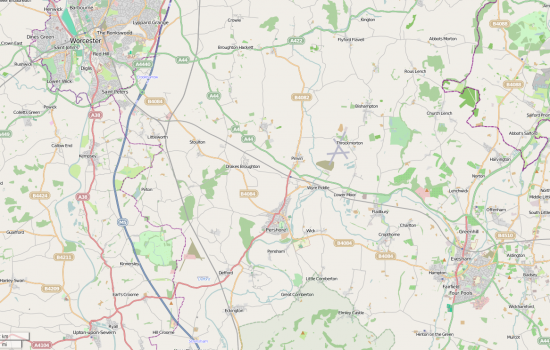
The other web-based map that most people will probably be familiar with is OpenStreetMap. Here’s the same area, again:
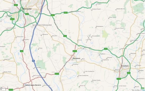
One of the nice things about OSM is that it gives you the option of different tile sets. Here it is with Mapquest Open tiles:
The Mapquest colour scheme is a lot like Bing, except clearer. Purely as a general purpose mapping application, I find OpenStreetMap to be by far the best, with the Mapquest tiles being better at overview levels and the standard OSM tiles being better when zoomed in.
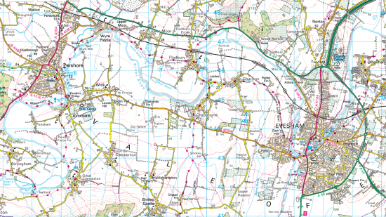
One that has to be mentioned, of course, is the grandaddy of them all as far as UK mapping is concerned: OS Maps. Unlike the others, OS maps don’t have a website of their own, instead, they are incorporated into other mapping sites. And they come into their own at closer zoom levels: there isn’t really anything to be gained from them at wider levels than the classic 1:50,000 series. But here are Evesham and Pershore on the OS map:
At that level of zoom, OS maps are genuinely unbeatable. The colours and iconography have been honed over decades of careful refinement, and, without the distraction of route-finding and advertising to contend with, the cartographers at OS have been able to fully concentrate on the maps themselves. It’s the inclusion of OS maps in Bing which gives Bing the edge over Google for close-up mapping, and their ability to combine OS maps with route-finding is unmatched as well.
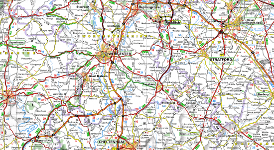
One other that’s worth mentioning, though, is a bit of a blast from the past. Veterans of European travel in the 20th century will be familiar with Michelin Maps, but not a lot of people know that they’re online as well. Michelin is the direct opposite to OS in that it’s the wider zoom levels where they excel, so here’s a screenshot of most of Worcestershire:
Once upon a time, before Google got into the mapping act, ViaMichelin was my favourite online mapping application. Unfortunately, their technology hasn’t really moved on much since those early days – just about the only enhancement is that their maps are now “slippy” – so they leave quite a lot to be desired now. But Michelin maps, like OS maps, are maps first and foremost rather than being a vehicle for search and route-finding (although ViaMichelin does do routes), so the quality of the cartograohy is second to none and vastly superior to Google. I only wish they did a useful API so that I could include them on my own websites!

